 (I mistaken referred to Jonathan Ives, Apple's Senior VP of Industrial Design as John. Updated to correct this error)
My Boss finally gave in after years of putting off his iPod purchase, but he pretty well made up for it in kick-ass-ness. Last Tuesday he got his kick-ass iPod Touch and showed it to our team as soon as he came in to the office (Yup, he still came.hehe. Peace Sir! )
Anyway, just some thoughts. When it comes to user interfaces, Apple is know for two things: something simple, and something flashy (and yet still simple). The success of the original, or should I say classic iPod, can be attributed to the first: Apple was able to make an interface so simple that almost anyone can use it without difficulties.
In fact, the classic iPod line's UI simplicity somehow masks the enormous talents of Apple's engineering, UI and industrial designers (hail to the king Jon Ives) in creating it.
As you would have probably guessed already, for this post, the second attribute of being flashy (and yet still simple) attribute will be all about the iPod Touch (and the iPhone).
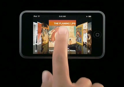
The iPod Touch (and its iPhone sibling) has the slickest UI available in any device available in the market today, bar none. It's so easy to use because its really simple that things behave as you expect them to behave, and it's so fun to use because Apple has made it flashy enough that you actually see visual feedback on what you're doing with the interface in the classic apple taste. Okay, I will just stop trying to describe it here because as the cliche goes, words doesn't do justice.